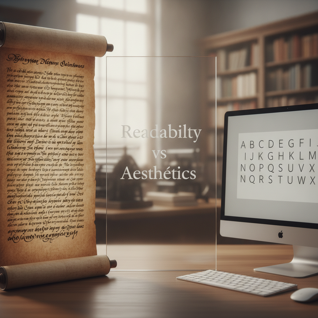
Readability vs Aesthetics: Finding the Balance in Type Design

Understanding the Importance of Type Design
Type design is a crucial aspect of visual communication, influencing how information is perceived and understood. While aesthetics play a significant role in attracting attention, readability determines how easily content can be consumed. The challenge lies in striking the right balance between these two elements to create effective typefaces that serve their purpose without compromising visual appeal.
The Role of Readability in Type Design
Readability refers to how easily text can be read and understood. Factors that impact readability include font size, letter spacing, line height, and the complexity of the typeface itself. Designers must ensure that the text is legible across various sizes and mediums. For instance, a typeface that looks stunning in a large header may become cumbersome in smaller body text. Hence, prioritizing readability ensures that the audience can swiftly grasp the content without straining their eyes.
The Aesthetic Appeal of Typography
On the flip side, aesthetics significantly affect how a message is received. A well-designed typeface can evoke emotions, set the tone of the content, and establish brand identity. The visual attributes of type—such as style, weight, and character shapes—contribute to an overall design narrative. A beautifully crafted typeface can captivate an audience, drawing them in and making them more receptive to the message. However, if the aesthetic choices come at the expense of readability, the impact may be diminished.
Finding the Balance
Achieving a balance between readability and aesthetics requires careful consideration and testing. Designers should start by defining the purpose of the text and the target audience. For instance, a playful typeface may be suitable for children's books but inappropriate for legal documents where clarity is paramount.
Additionally, using contrasting weights and sizes within a type family can enhance both readability and visual interest. Pairing a decorative headline with a simple body font can create an engaging hierarchy that guides the reader through the content effortlessly.
“Good typography is about more than just choosing a beautiful typeface; it’s about ensuring that the message is communicated clearly and effectively.”
Conclusion
Ultimately, type design is a balancing act where both readability and aesthetics must coexist harmoniously. By prioritizing the needs of the audience and the context of the content, designers can create typefaces that are not only visually appealing but also functional. This careful equilibrium will lead to more effective communication and a better overall experience for the reader.