Type Hierarchy: Guiding the Reader Through Visual Weight
Understanding Type Hierarchy
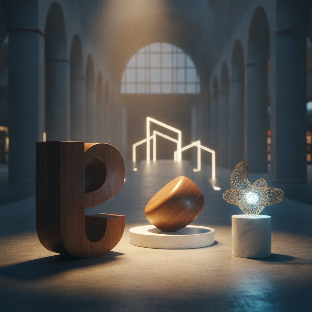
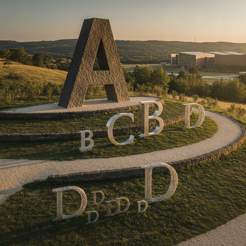
Type hierarchy is a fundamental concept in typography and design that plays a crucial role in guiding the reader's attention through text. By establishing a clear visual weight among different text elements, designers can create a more engaging and readable experience. This article will explore the principles of type hierarchy and how to effectively utilize visual weight in your designs.
The Importance of Visual Weight
Visual weight refers to the perceived heaviness or significance of an element in a design. In typography, this can be influenced by factors such as font size, style, color, and spacing. By strategically varying these elements, designers can direct the reader's focus, making important information stand out while guiding them through the content in a logical manner.
"The art of typography lies in its ability to communicate not just through words, but through the visual presentation of those words."
Establishing a Clear Hierarchy
To create an effective type hierarchy, start by identifying the key elements of your content. These might include headings, subheadings, body text, and any call-to-action elements. Once you have a clear understanding of these components, you can assign varying levels of visual weight to each.
Practical Tips for Implementing Type Hierarchy
Here are some practical tips to help you establish a strong type hierarchy:
- Use Font Size: Larger fonts naturally draw more attention. Reserve larger sizes for headings and subheadings to indicate importance.
- Incorporate Font Styles: Experiment with bold or italic styles to emphasize certain words or phrases, signaling their significance.
- Utilize Color: Different colors can create contrast, making specific text elements pop and guiding the reader's eye.
- Adjust Spacing: Adequate line height and letter spacing can improve readability and help different text levels stand apart.
Conclusion
Mastering type hierarchy and visual weight is essential for effective communication in design. By thoughtfully considering how different text elements relate to one another, you can create a seamless flow that enhances readability and draws the reader's attention to the most important content. Remember, a well-structured type hierarchy not only improves aesthetics but also elevates the overall user experience.